A Strategic Shift Toward Brand Consistency and Visual Alignment
Discover how a school district branding initiative evolved from a single presentation into a comprehensive rebrand that unified digital presence, athletic identity, and community perception. This project showcases the power of consistent visual identity, strategic communications, and cross-department collaboration in driving brand recognition and trust.
“
It was a typical day in the fast-paced world of school communications—bouncing from event to event, meeting to meeting, and collecting new tasks like Pokémon… except there was never time to actually do the tasks. But on this particular October day in 2022, I had carved out time to present to our athletic coaches on something near and dear to my heart: branding.
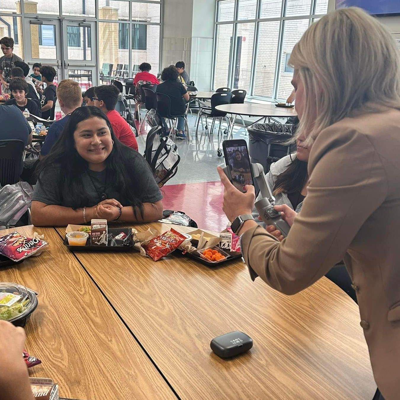
Specifically, I was there to talk about which brand elements—colors, logos, fonts—they should use when creating graphics to promote their programs and post on athletic social platforms. Easy enough. I talk to groups all the time. But something about this group made me feel off. I wasn’t sure why… until I opened my presentation.
“
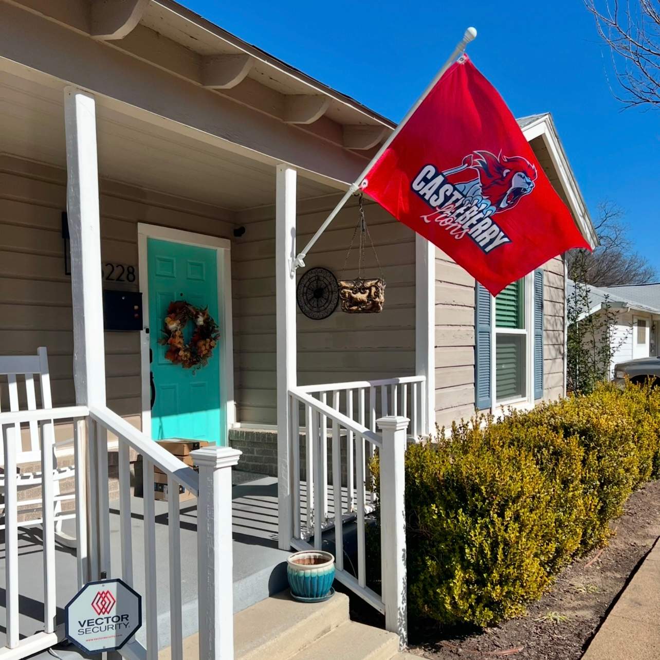
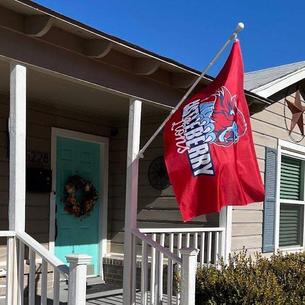
Let’s talk colors. At the time, our official brand palette—according to our website—consisted of a deep, nearly maroon red (#760300), a steel-ish blue (#4e7aa7), a nearly-black navy (#0b1a39), and a beige/tan (#d3cbb5). These were the colors I had inherited when I first stepped into this role, and like any good rule-follower, I ran with them. I went from campus to campus spreading the gospel of consistent branding, proudly watching as teachers and staff across Castleberry ISD began adopting the colors. Victory, right?

Well… not quite.
There was just one glaring problem: those colors looked nothing like what our athletes were wearing on the field. And on that day, standing in front of the coaching staff, it finally clicked. That’s why I’d felt uncomfortable. I was asking people to use brand colors that didn’t actually reflect what our community saw every Friday night under the stadium lights. There was a growing disconnect between our brand and our identity—and I couldn’t unsee it.
And that’s when the lightbulb moment happened.
If we update our actual brand colors—aligning the website with print products and apparel—then everything else would start to fall into place. The visuals on our buses, billboards, mailers, and social feeds would align with the jerseys on the field. The brand would feel authentic. And recognition? It would skyrocket.

From that moment forward, it was game on.
Now that you know the backstory...
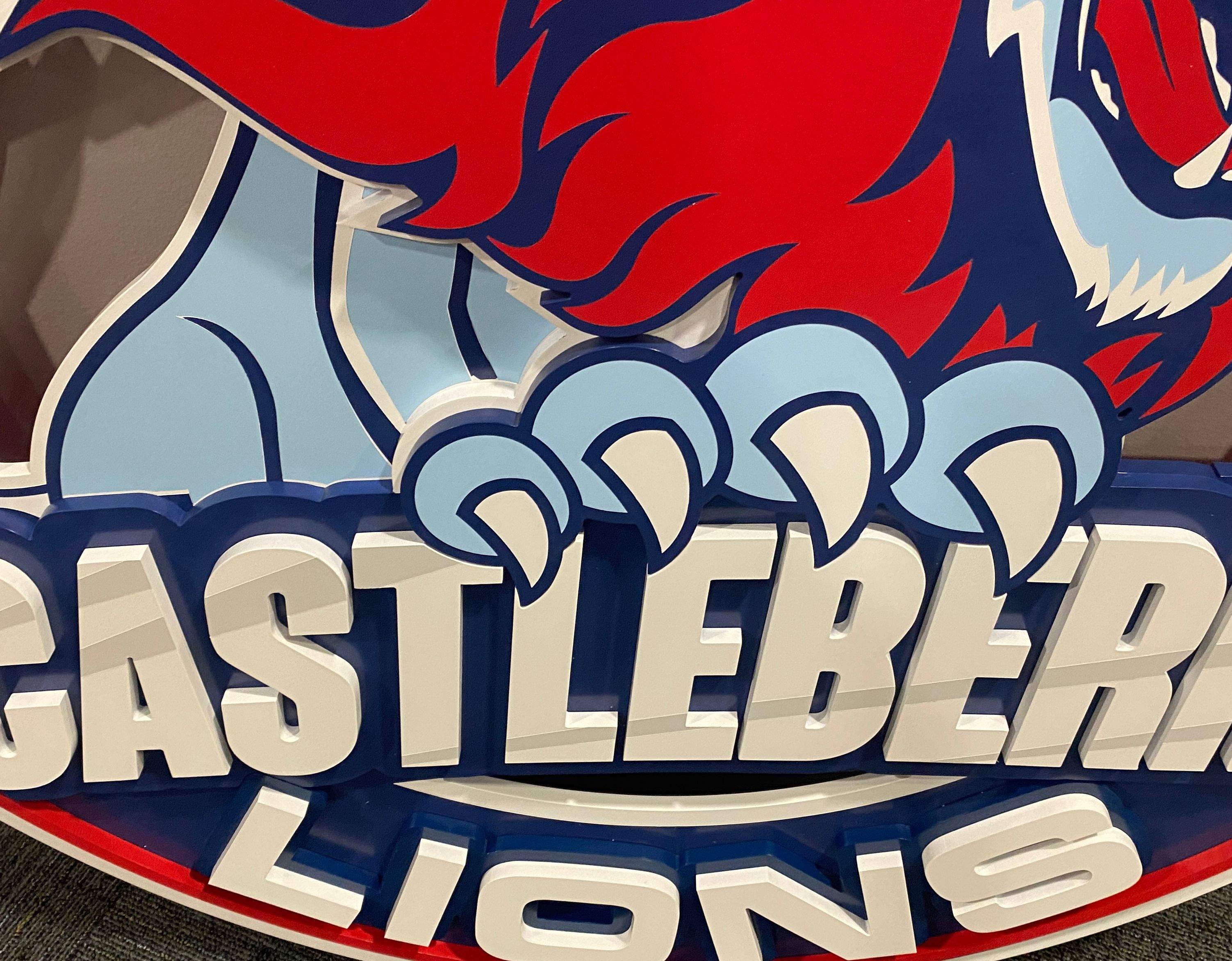
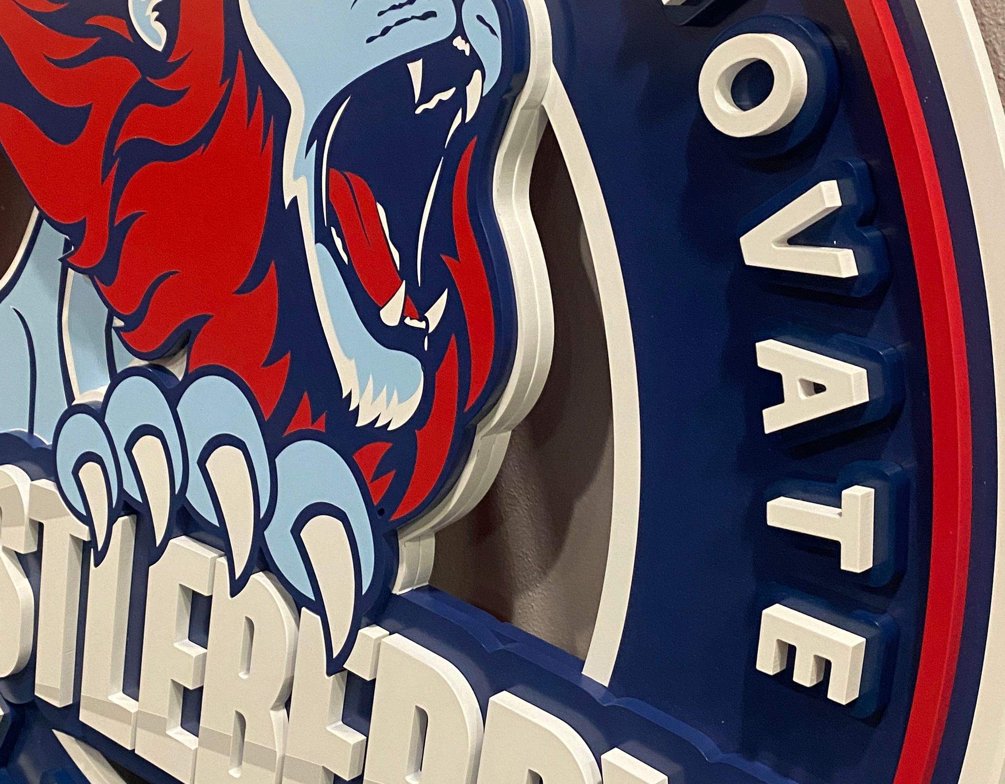
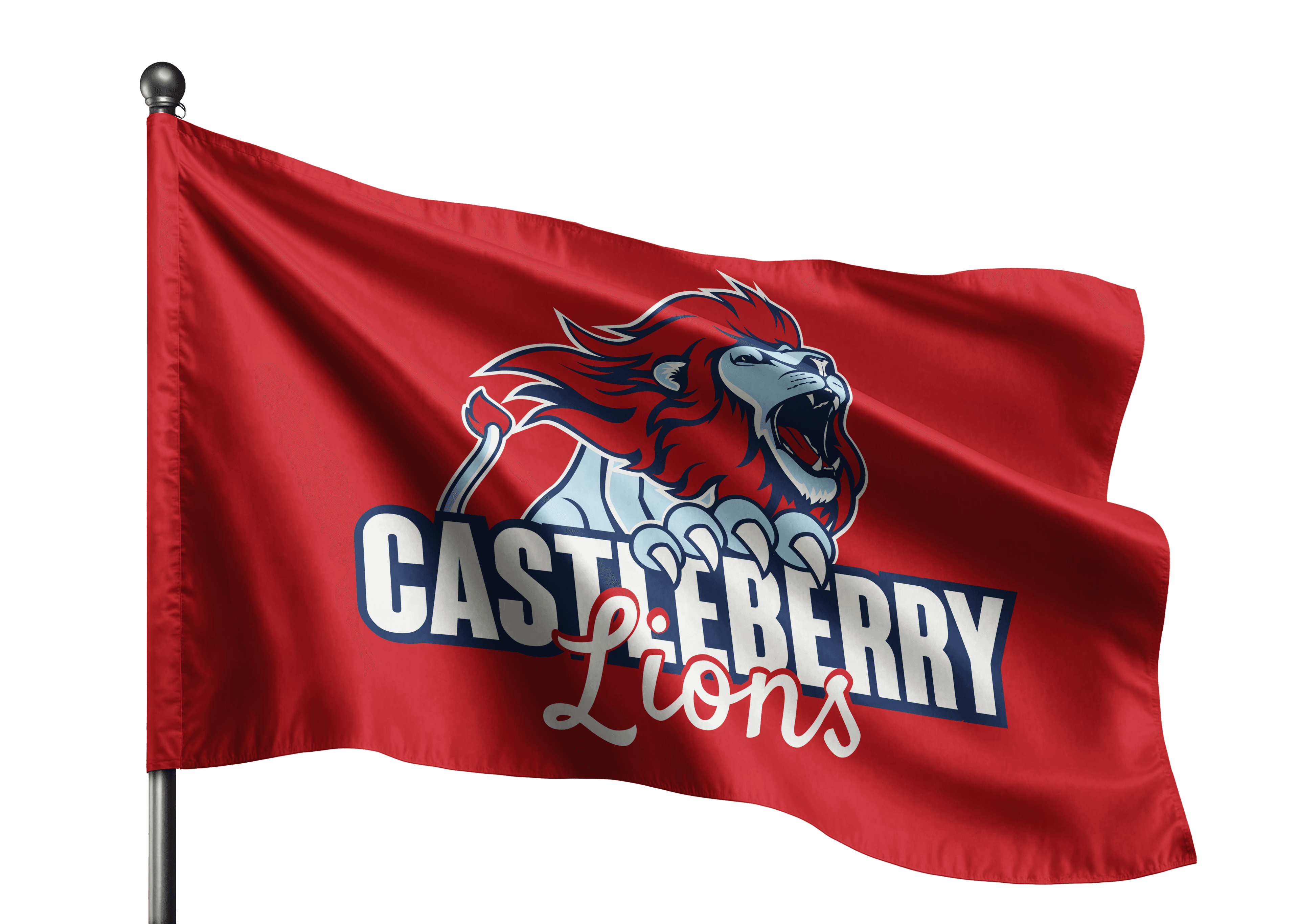
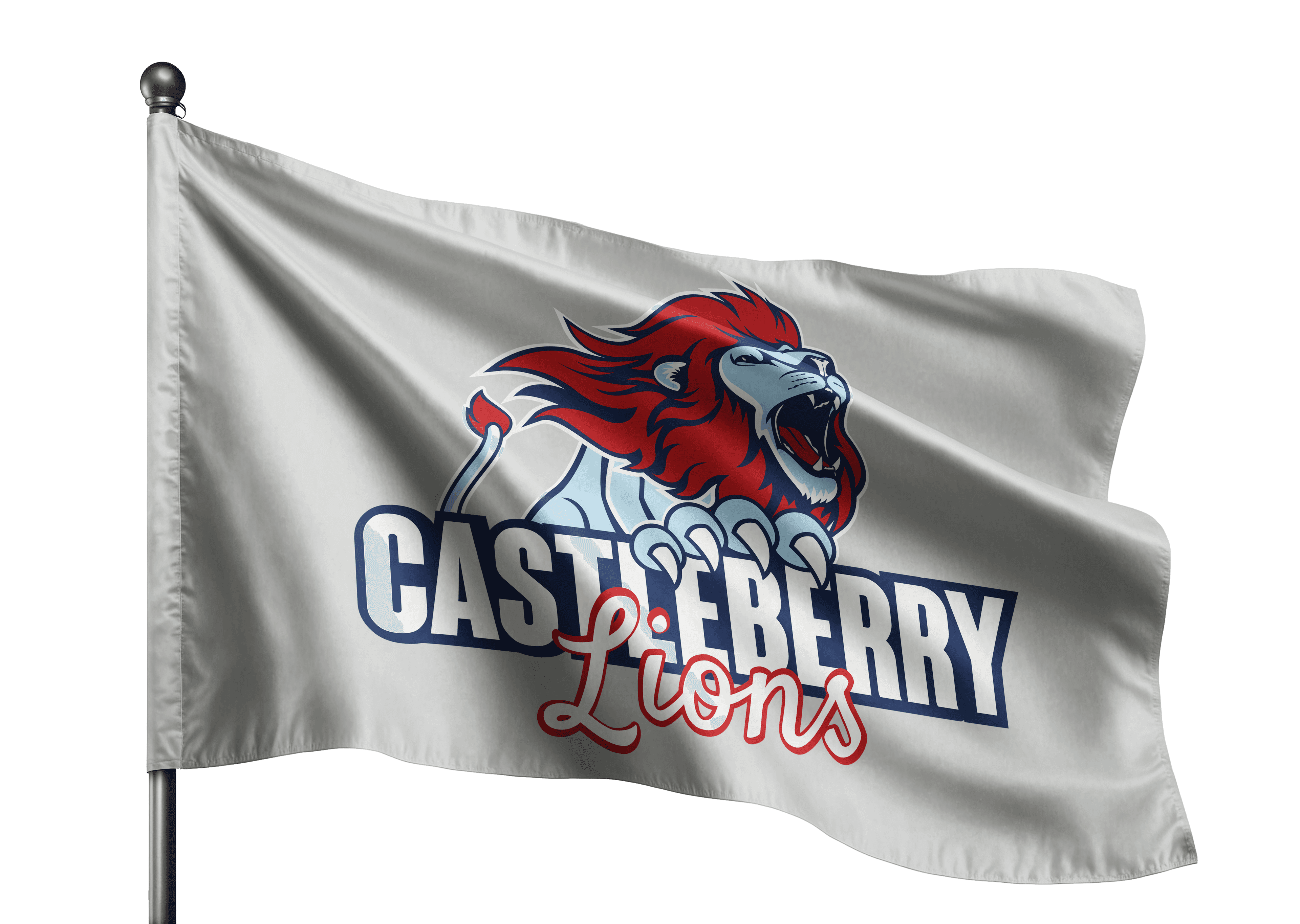
I’m proud to reveal Castleberry ISD’s refreshed brand identity, officially established in May 2023.
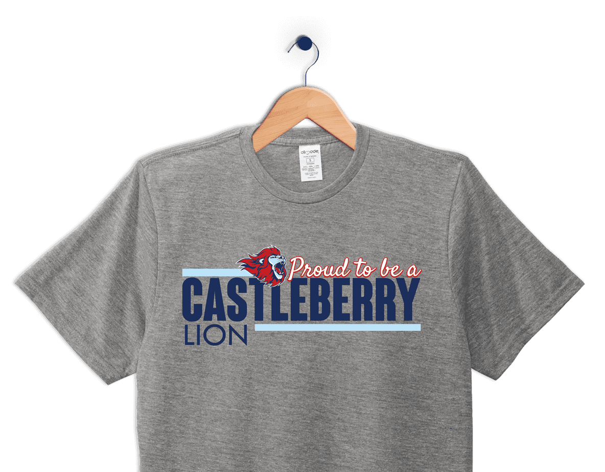
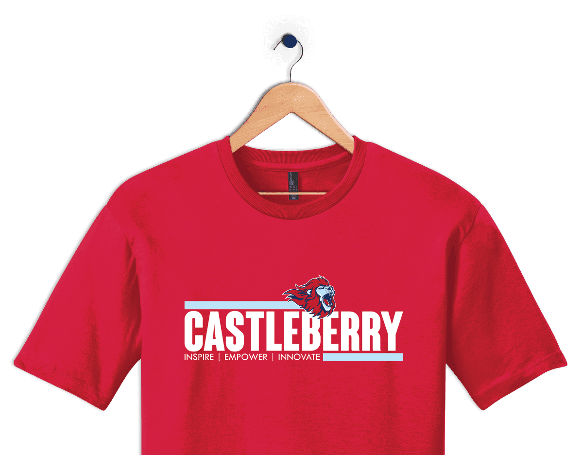
Custom Castleberry Merch


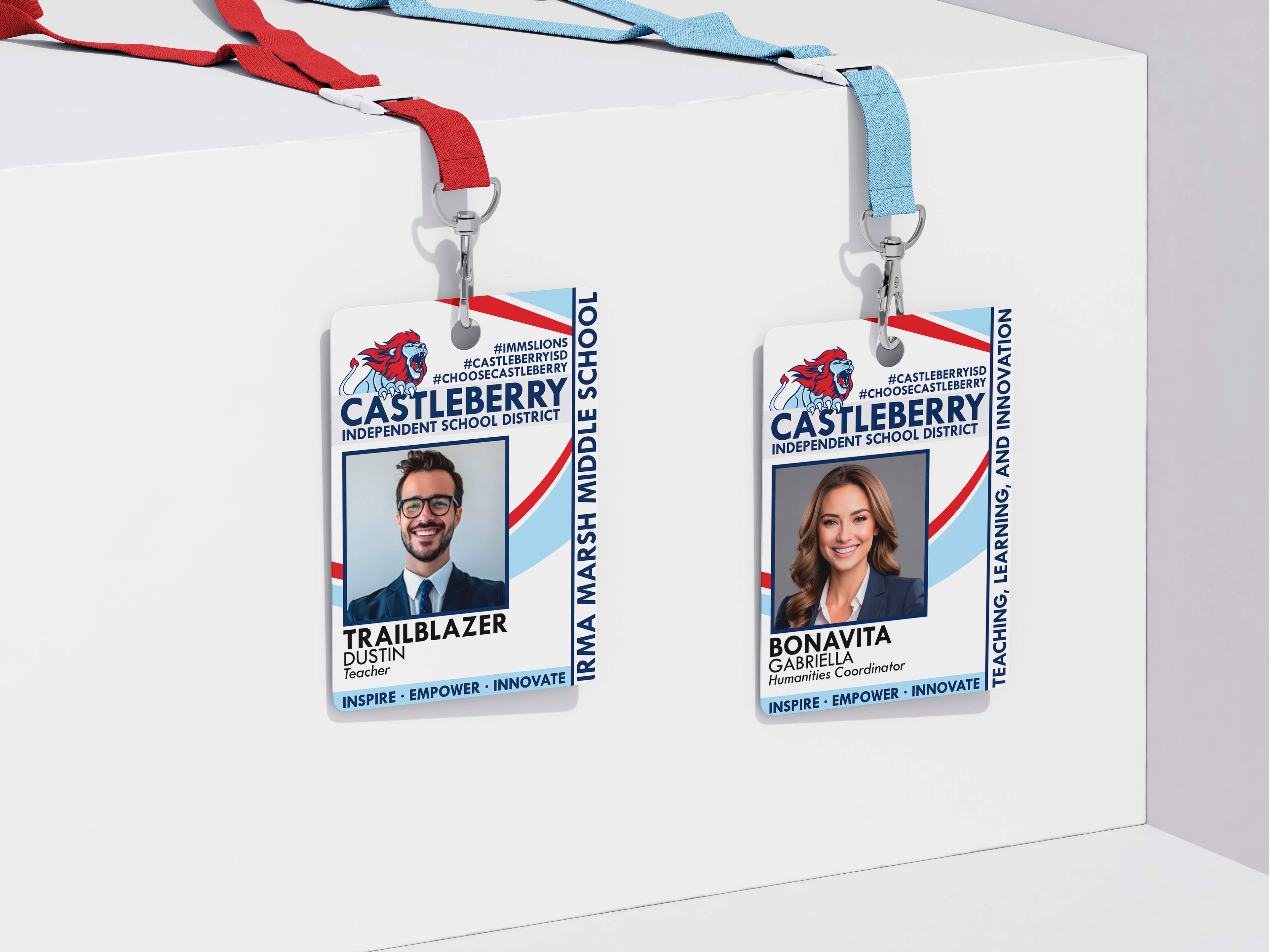
Refreshed Employee Badges
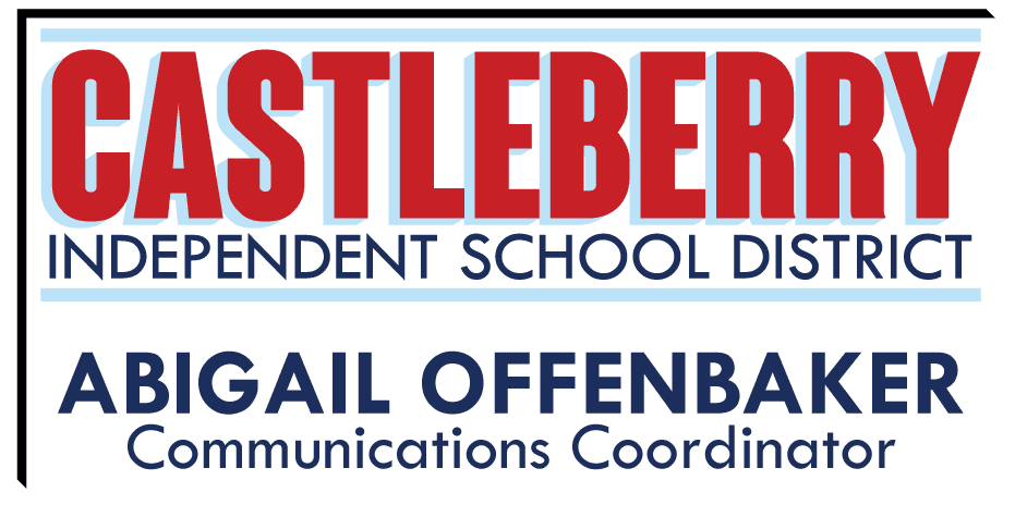
Our employee ID badges are designed with customization in mind, ensuring alignment with each campus or department. The wording on the right side of the badge is tailored to reflect the specific campus or department, and the hashtags are adjusted accordingly. This personalization strengthens our district's branding while fostering a sense of community and identity across all teams.
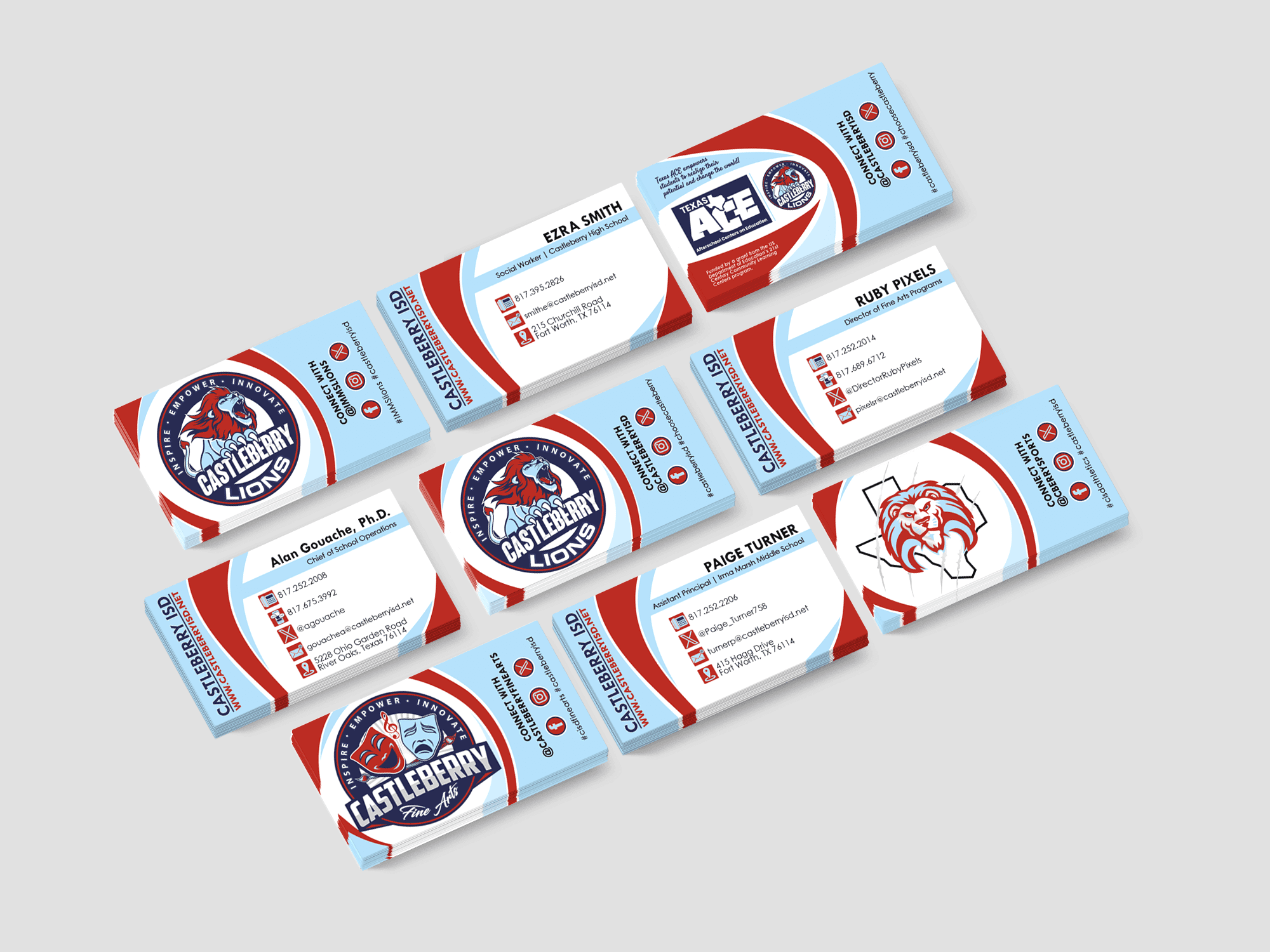
Business Cards
Our district's business card template offers flexibility with 10 variations tailored to individual campuses and departments. Additionally, staff can choose from 5 different options for contact information on the front, resulting in a total of 50 unique design combinations. This allows for customized, professional cards that align with our branding while meeting the diverse needs of our team.
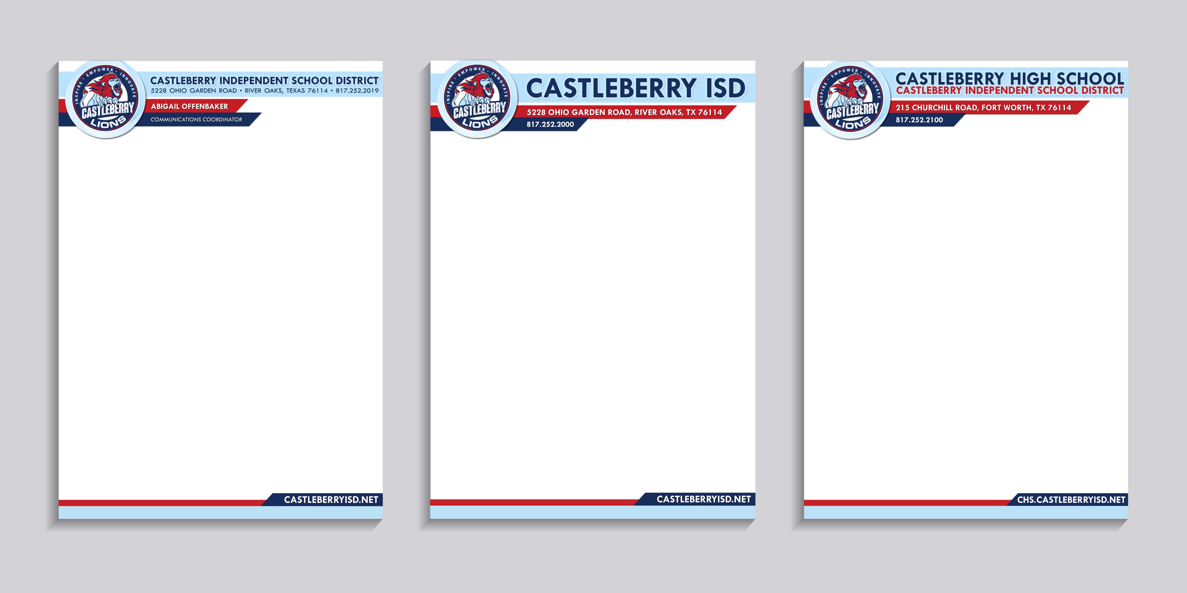
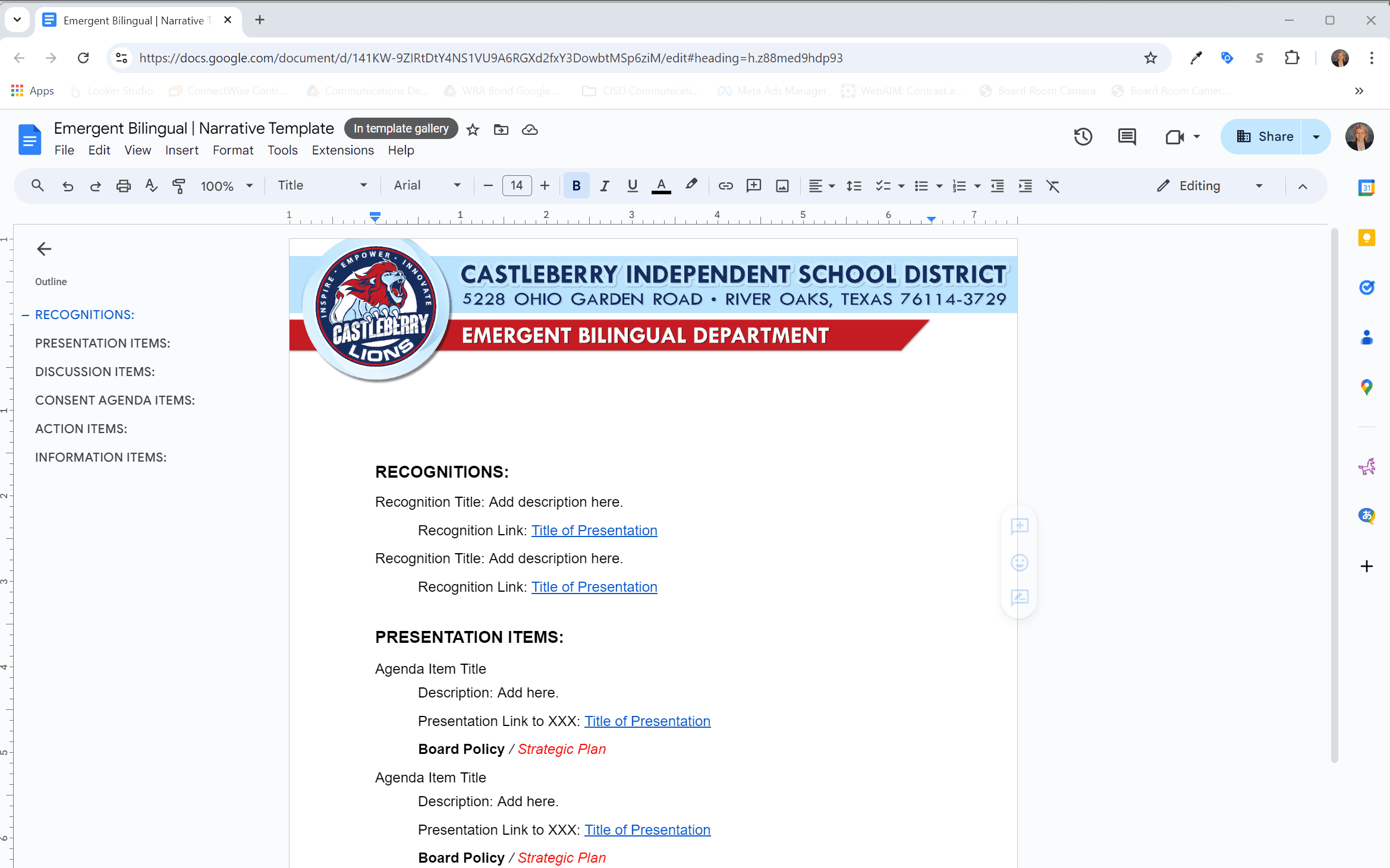
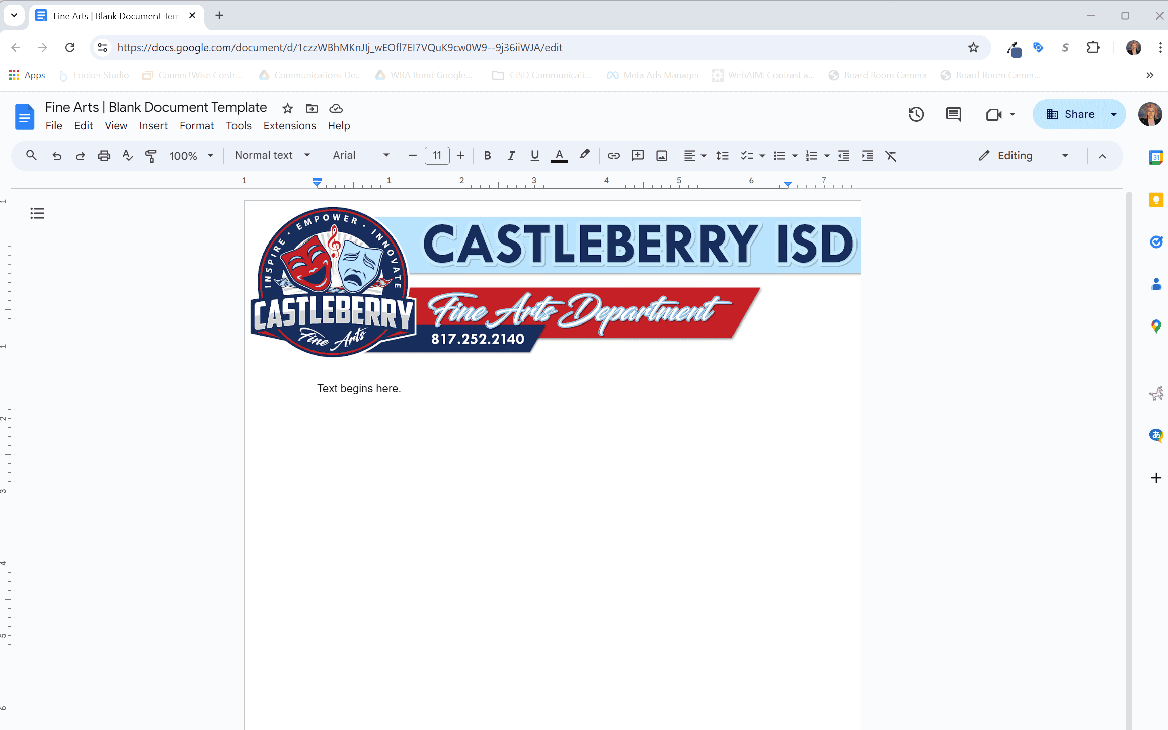
Stationary
Document templates were created for campus, department, and administrators. Although the information on each is different, all align in terms of visual identity to reflect the overall Castleberry ISD brand.
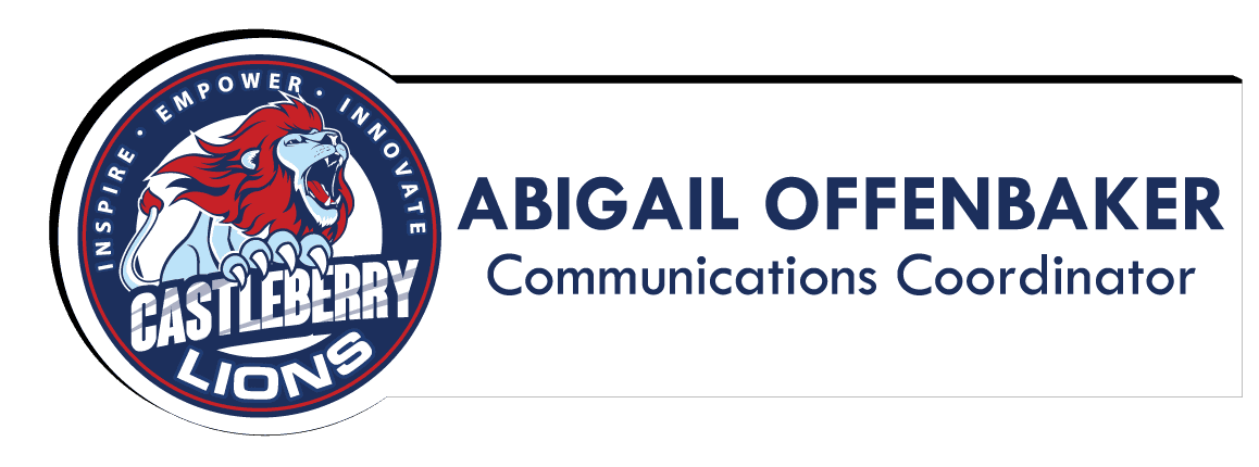
Magnetic Name Tags
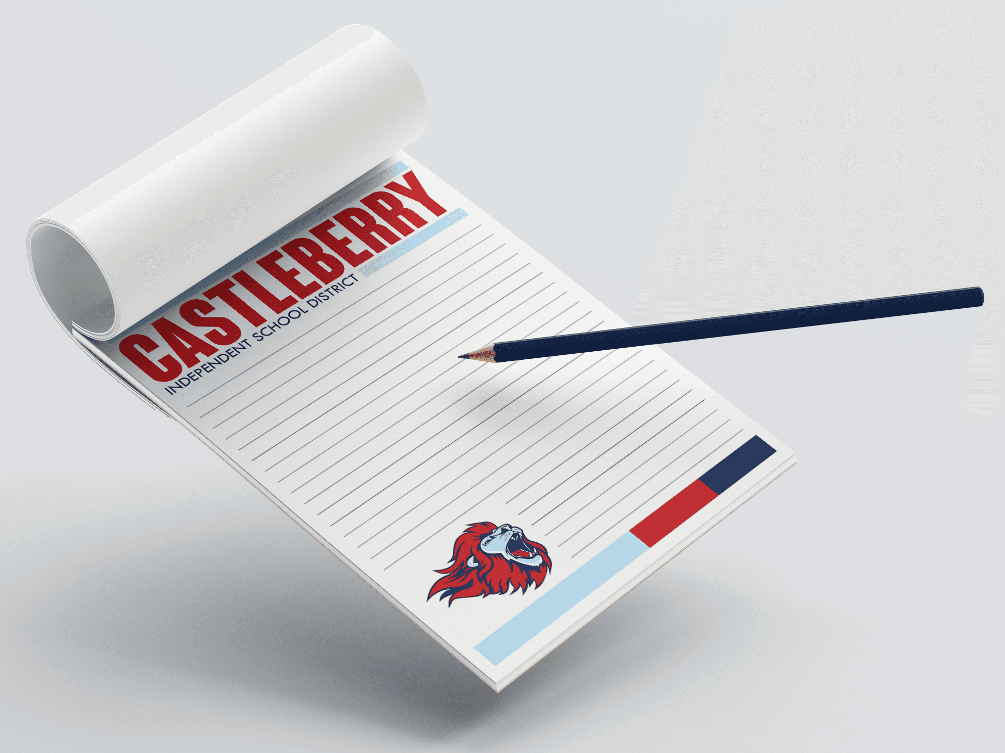
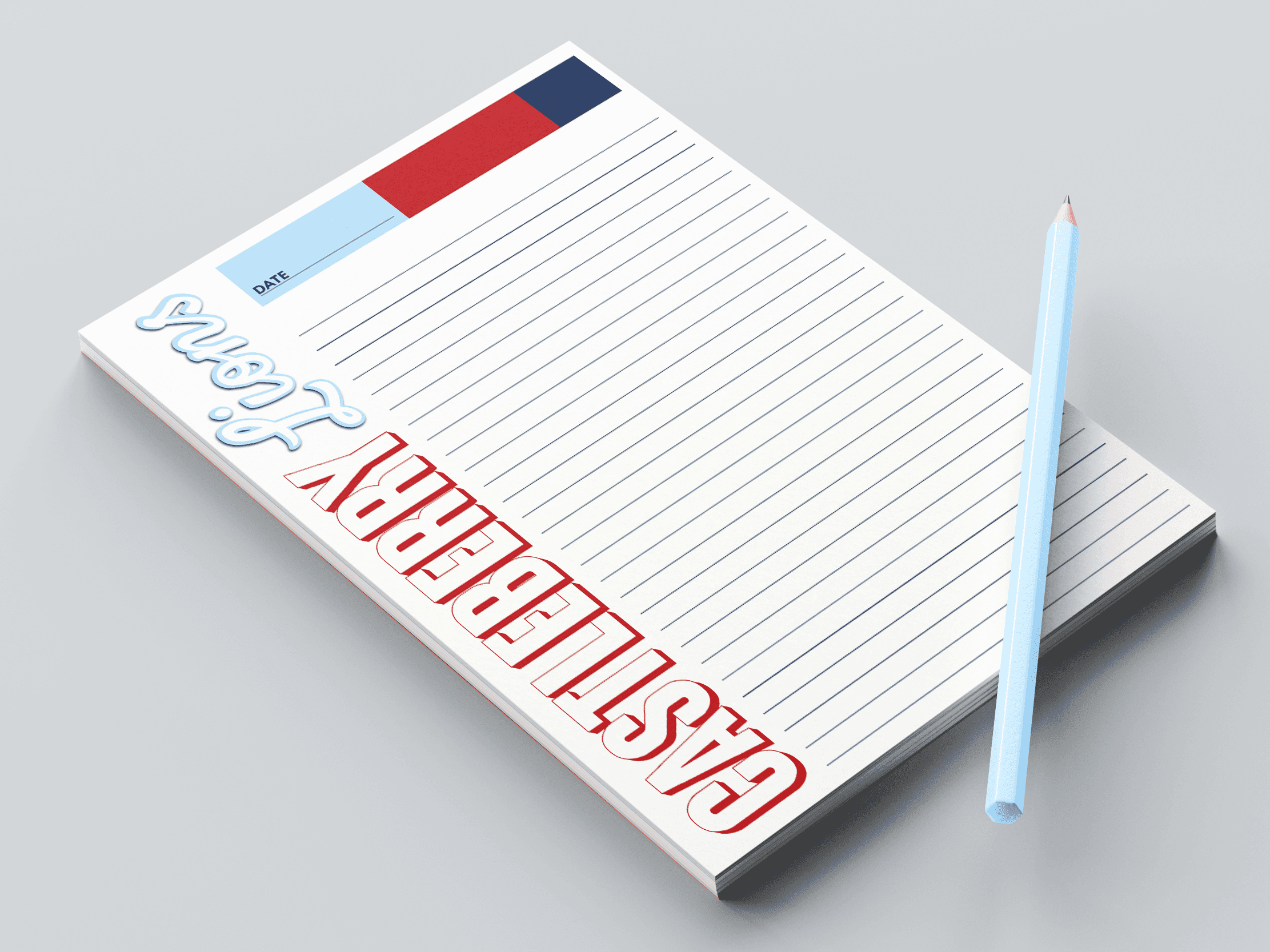
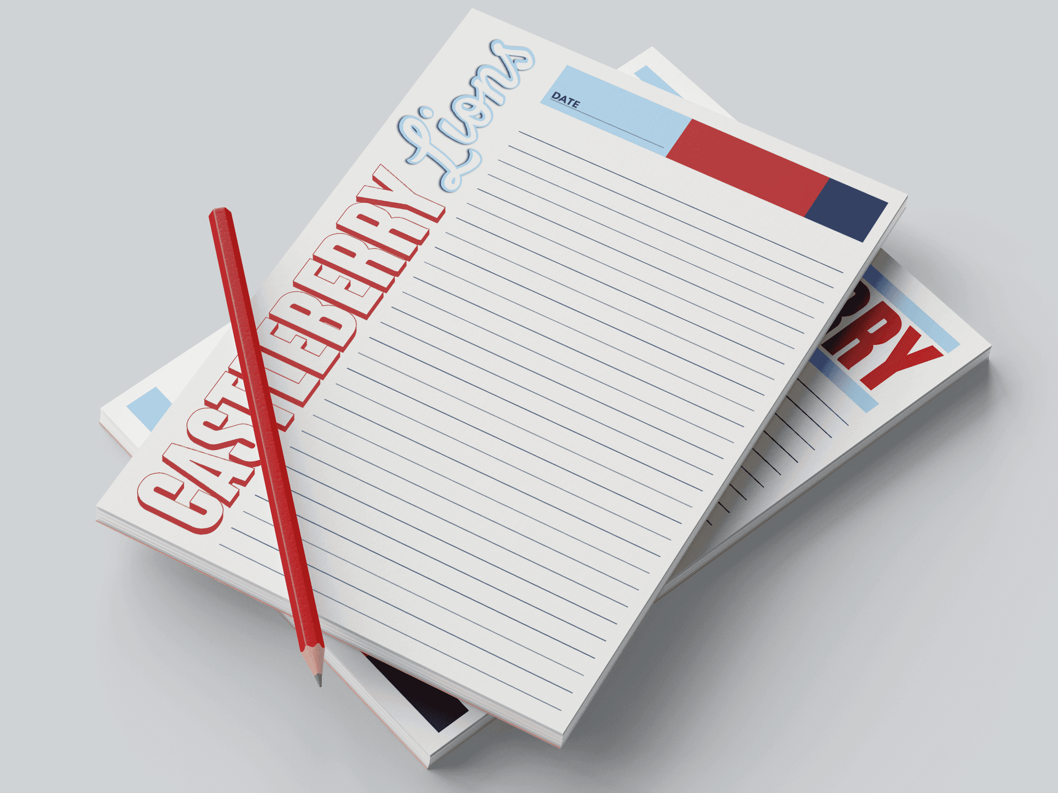
Castleberry Note Pads
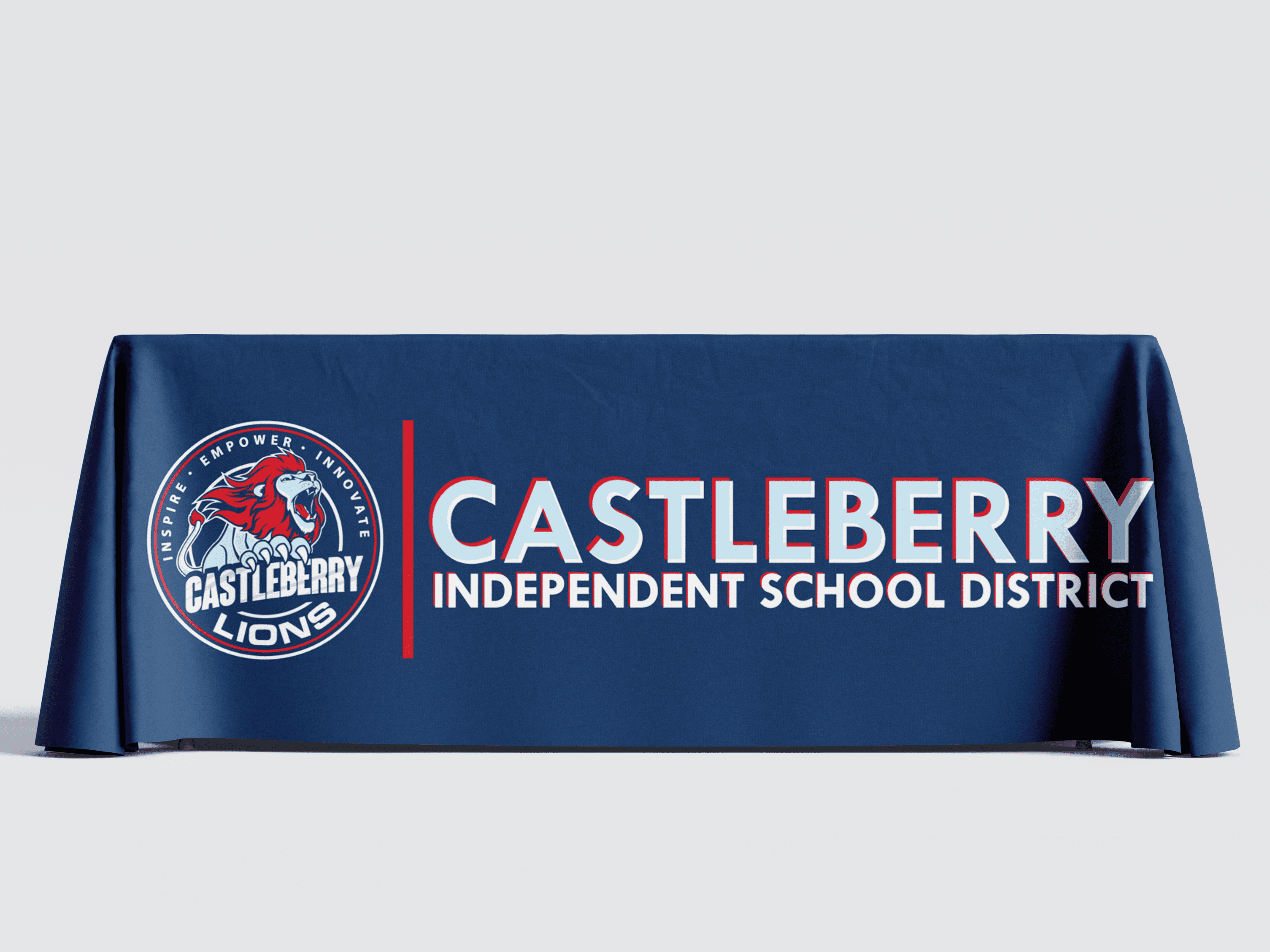
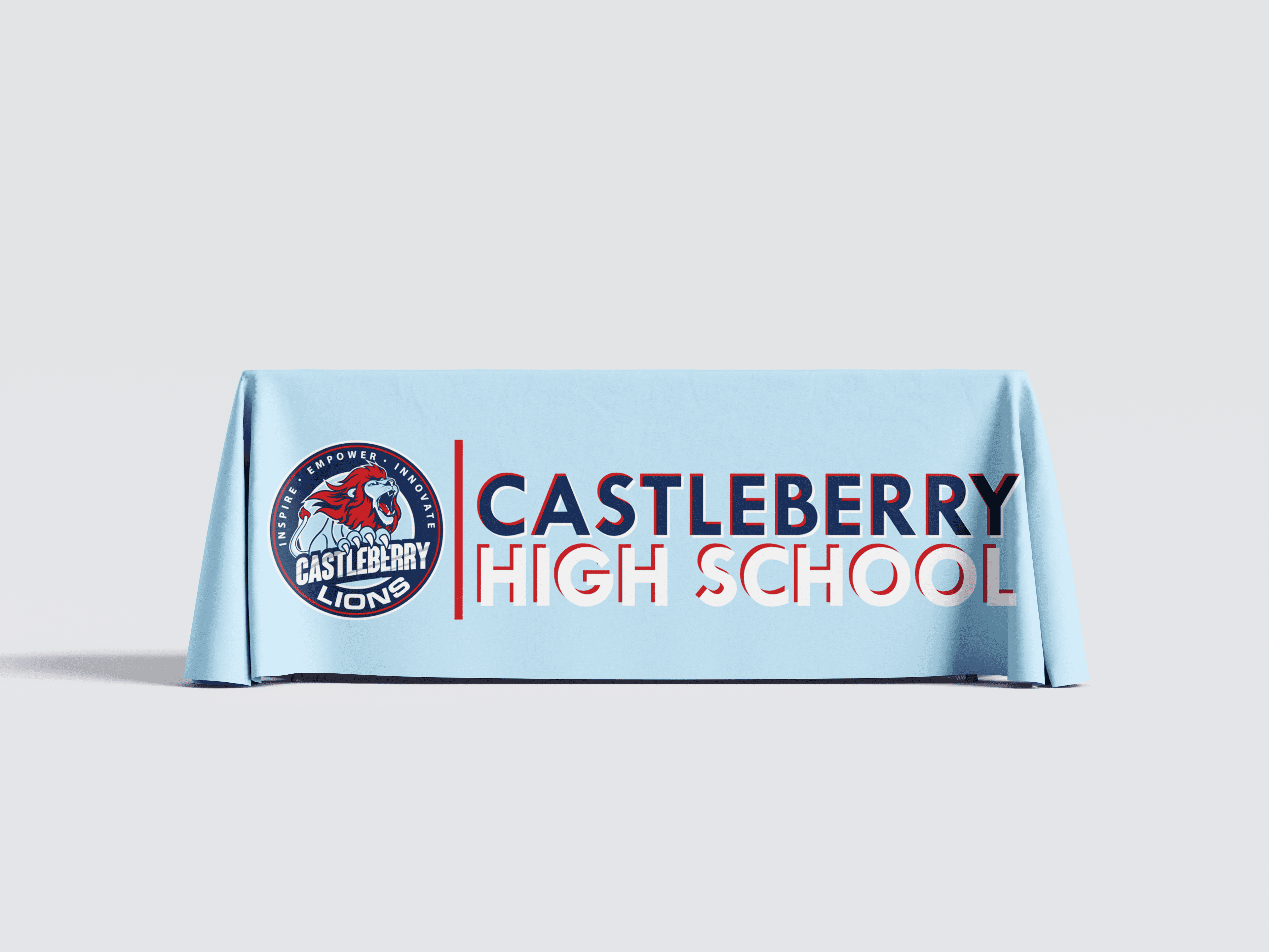
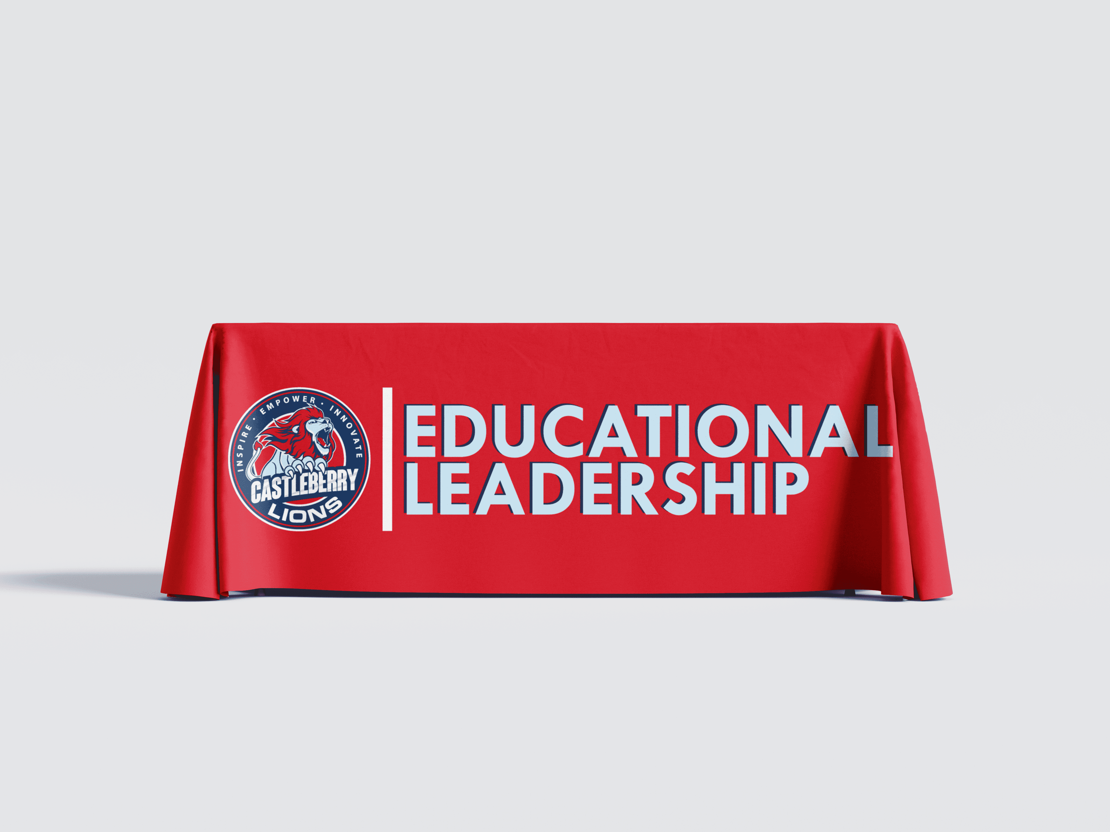
Tablecloths
Tablecloth designs were created for each campus and department. These allow for each to showcase their department or campus while maintaining consistency and alignment to the overall district brand.