01 — Project Details
Overview
Led a large-scale brand transformation to eliminate logo fragmentation, architect a scalable identity system, and implement governance frameworks that improved consistency, adoption, and measurable enrollment growth.
My role
Sole communications and brand lead overseeing strategy, identity architecture, design direction, rollout, stakeholder enablement, and long-term governance.
Scope
District-wide identity system (district → campus → program) implemented across web, print collateral, templates, campaigns, and branded assets.
02 — Creative Process
Audit → Architecture → Enablement → Governance
Brand Audit
Cataloged inconsistencies and prioritized high-visibility touchpoints.
Brand Architecture
Built a scalable identity system (district → campus → program).
Enablement
Created templates and trained stakeholders to ensure adoption.
Governance
Implemented approval workflows to protect long-term consistency.
03 — The Challenge
Multiple competing logos and unofficial variations across the organization
No brand standards or repeatable templates
Inconsistent look/feel across web, print, programs, and campaigns
Brand confusion diluted recognition and slowed production
04 — Goals
Create a scalable brand system that reduces one-off design requests
Increase consistency across channels and stakeholders
Strengthen trust, recognition, and campaign effectiveness
05 — Key Deliverables
Brand architecture (district/campus/program)
Identity system + logo suite
Branded templates (print + digital)
Campaign creative (enrollment, recognition, community)
Web + social brand alignment
Governance process for brand approvals
06 — Results
Outcomes
Established a unified district identity system with clear hierarchy for campuses and programs.
Increased brand consistency across owned channels and marketing materials, strengthening trust and recognition.
Supported enrollment marketing and community awareness efforts with cohesive campaigns and brand applications.
Contributed to measurable growth — including 165% increase in out-of-district enrollment during the era of brand standardization and integrated marketing.
Brand Architecture
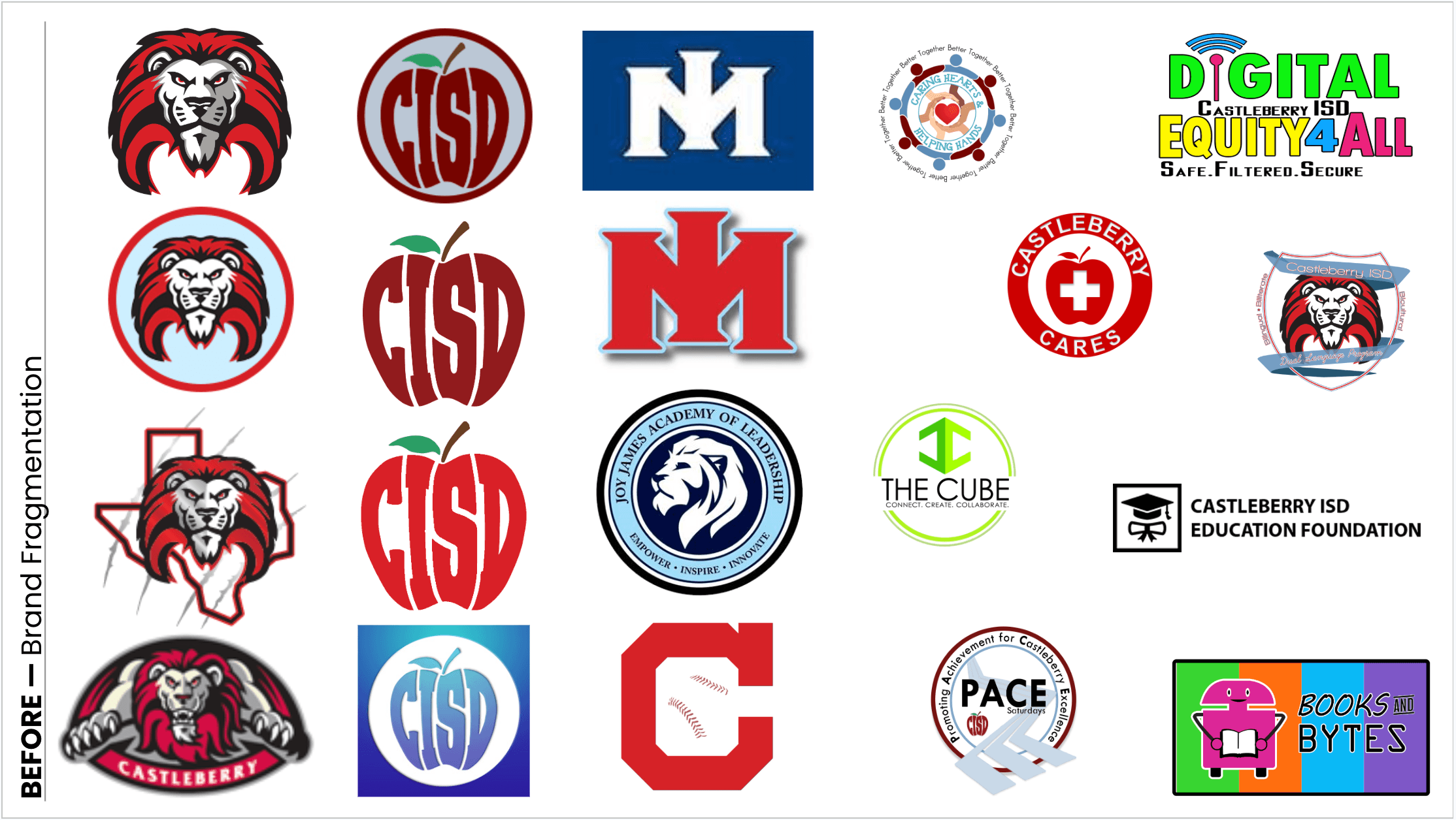
Before —
Brand Fragmentation
Prior to establishing a unified brand system, Castleberry ISD’s visual identity had expanded organically across campuses, programs, and initiatives.
Over time, new logos were created to represent specific efforts — often without a governing framework. While well-intentioned, this approach led to visual inconsistency and brand dilution.
Common issues included:
Multiple lion illustrations with varying proportions, line weights, and color values
Inconsistent CISD apple marks across print and digital applications
Campus lettermarks with differing styles, shadows, and treatments
Program logos developed independently, without alignment to a central identity system
No defined hierarchy distinguishing district, campus, and initiative-level branding
The result was a fragmented visual ecosystem — where similar marks differed in execution and brand recognition was diluted across touchpoints. The absence of a scalable brand architecture made long-term consistency difficult to sustain.
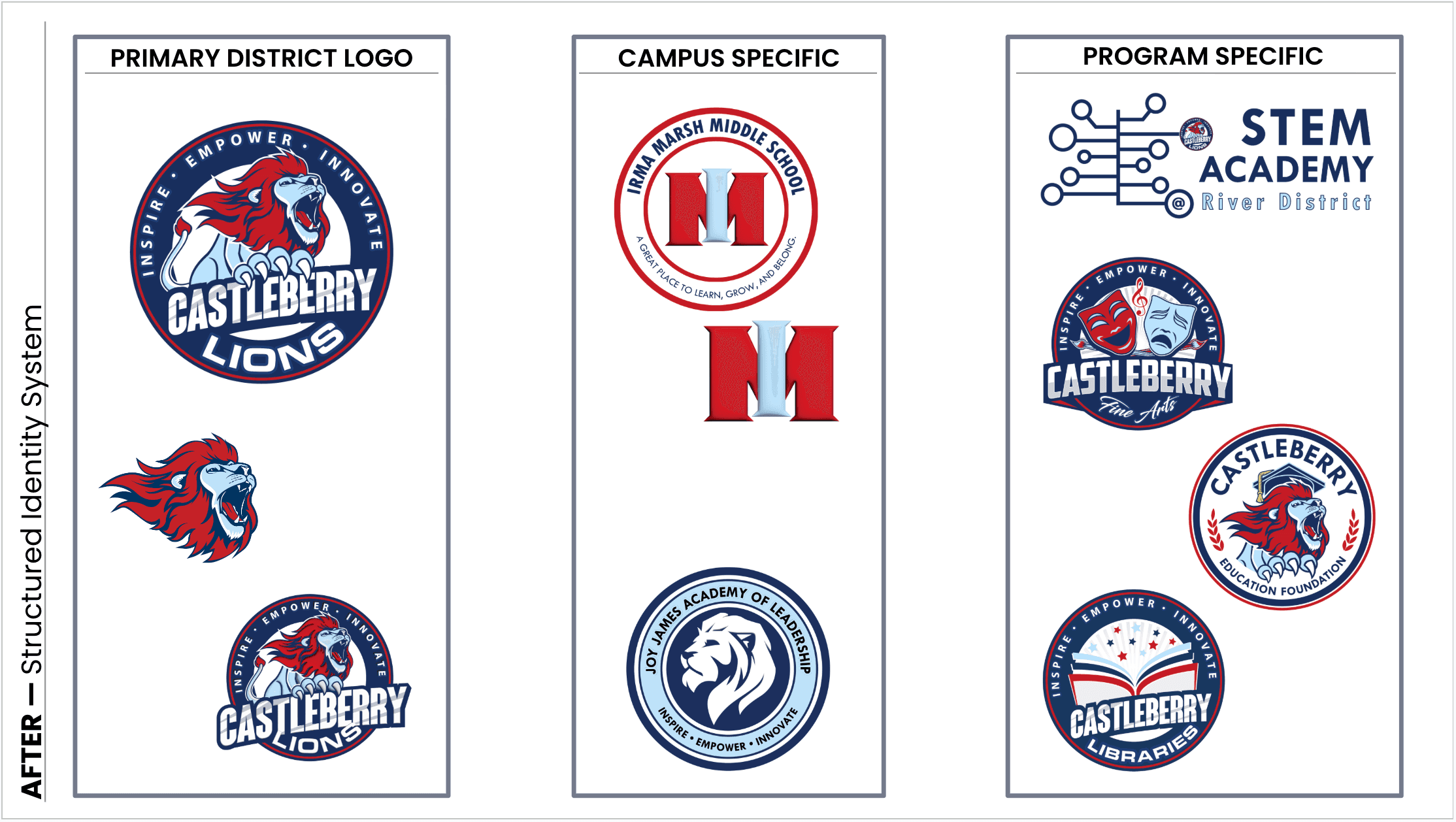
After —
Structured Identity System
To address fragmentation, a formal brand architecture was established — defining clear hierarchy and governance across district, campus, and program levels.
The system introduced:
A Primary District Logo serving as the visual anchor for all communications
Structured Campus-Specific Variations built within a consistent framework
Governed Program Extensions designed to align with core brand elements
Rather than allowing independent logo creation, new initiatives were developed within predefined guardrails — preserving flexibility while maintaining cohesion.
The architecture ensured:
Consistent color, typography, and iconography across touchpoints
Clear hierarchy between district, campus, and program identities
Reduced proliferation of one-off marks
Long-term scalability for future growth
The result was a unified visual system that strengthened recognition while supporting operational needs across the organization.
Branded Document Templates
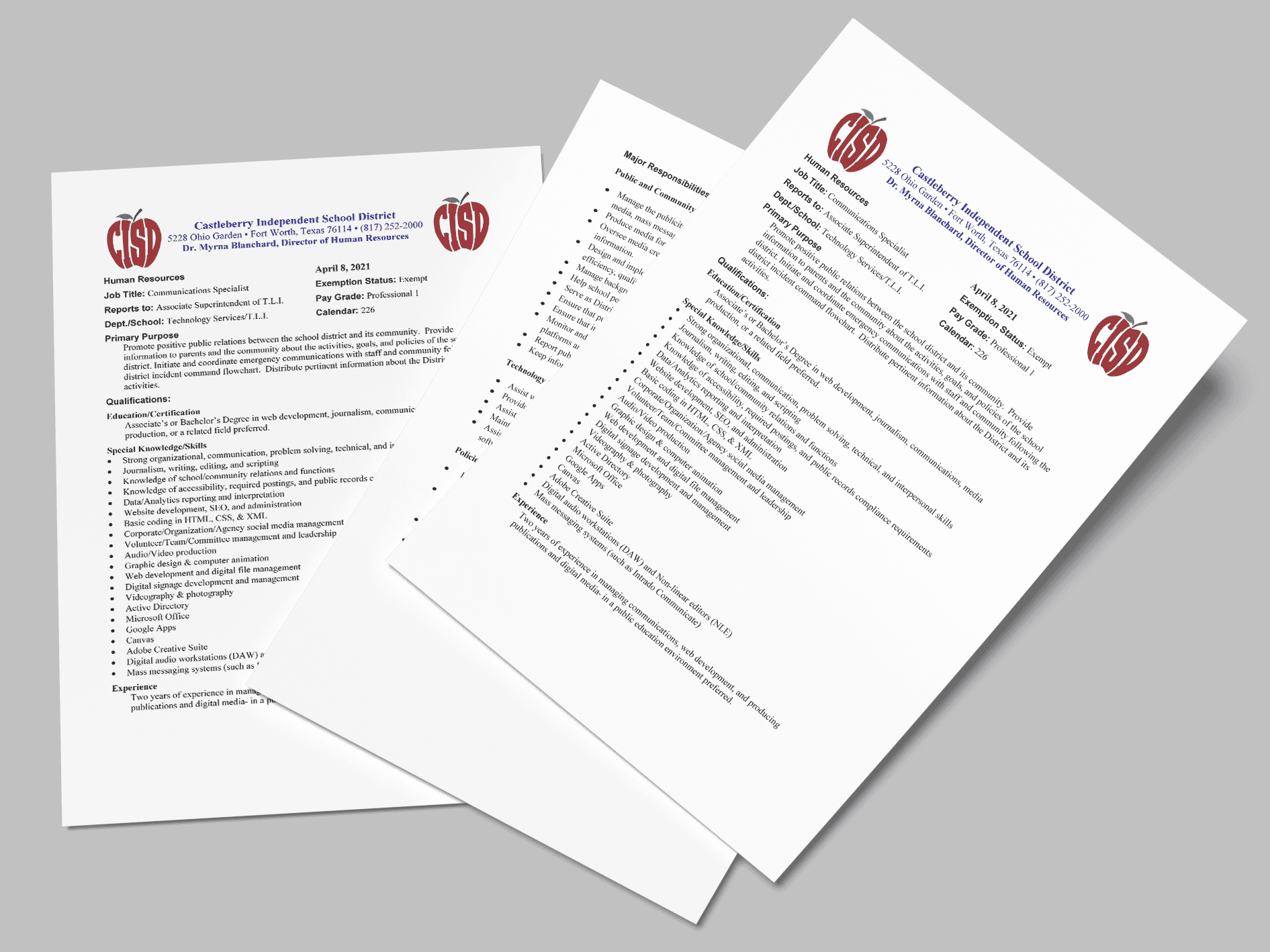
Before — Decentralized & Structurally Redundant
Official district correspondence lacked a standardized layout and visual hierarchy. Multiple logo variations were used, typography differed by department, and no scalable template system existed.
In several instances, the district logo appeared more than once within the same document header, creating visual clutter and weakening brand hierarchy rather than reinforcing it.
The result was:
Brand dilution
Redundant visual elements competing for attention
Inconsistent external touchpoints
Unnecessary design dependency for routine communications
After — Structured, Scalable Brand Infrastructure
The redesigned letterhead introduced a clear header architecture, defined logo hierarchy, consistent typography, and intentional white space — eliminating redundancy and restoring visual clarity.
Templates were integrated into the district’s Google Workspace Template Gallery, embedding brand-compliant documents directly into staff workflow.
This transformed brand standards from static guidelines into operational infrastructure.
Improvements included:
Clear header architecture
Defined logo hierarchy
Consistent typography and spacing
Integrated Google Workspace template distribution
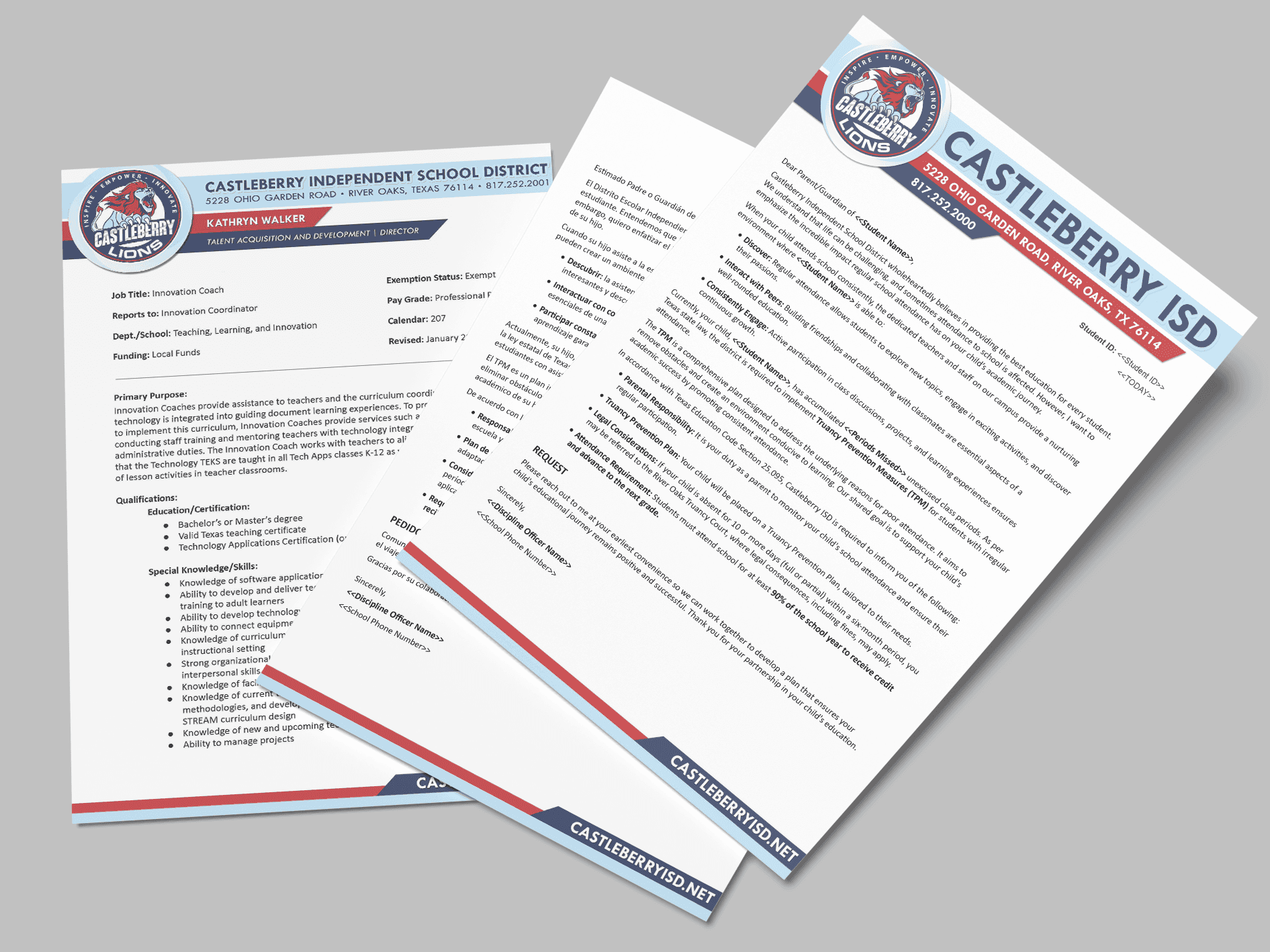
Impact:
Improved visual hierarchy and brand clarity
Increased template adoption through accessibility
Reduced ad hoc design requests
Ensured long-term brand governance across campuses
District Calendar Redesign
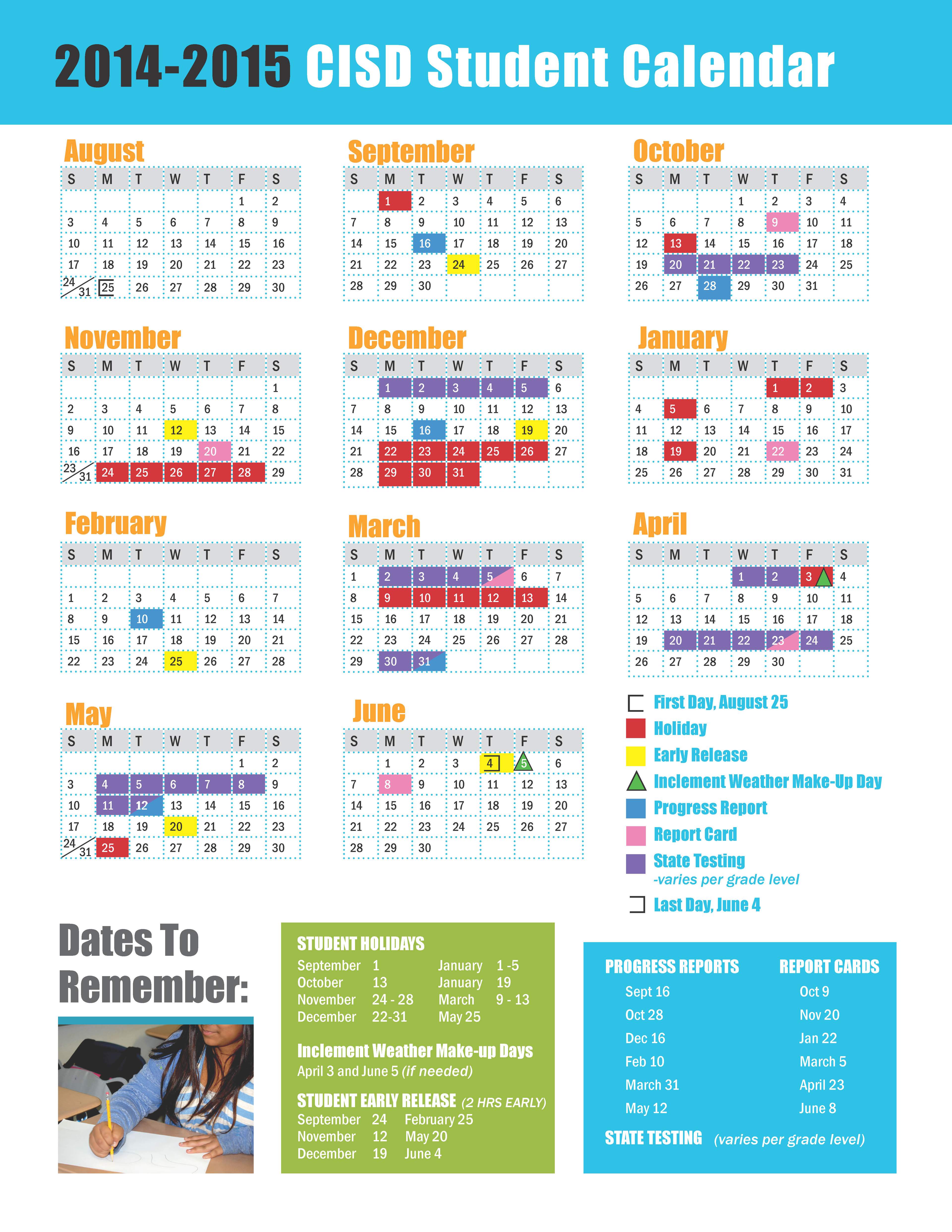
Before — Visually Fragmented & Structurally Inconsistent (2014–2015)
The 2014–2015 calendar relied on heavy color blocks, segmented content panels, and inconsistent typography. Information was spread across multiple boxed sections, creating competing visual priorities and limiting scanability.
Key challenges:
Multiple saturated color fields competing for attention
Inconsistent typographic hierarchy across headings and sections
Dense information blocks with minimal white space
Weak alignment with a unified district brand identity
While functional, the document felt visually crowded and lacked a clear structural system.
After — Structured, Brand-Led & Parent-Focused (2025–2026)
The redesigned 2025–2026 calendar introduced a disciplined layout architecture anchored by a strong district masthead and a consistent brand hierarchy.
Improvements included:
A clear visual anchor through the CASTLEBERRY ISD header
Simplified, structured three-column layout
Controlled use of brand colors for emphasis
Streamlined legend and grading period organization
Improved white space and readability
The redesign shifted the calendar from a color-driven information sheet to a structured, brand-aligned communication tool that prioritizes clarity and usability for families.
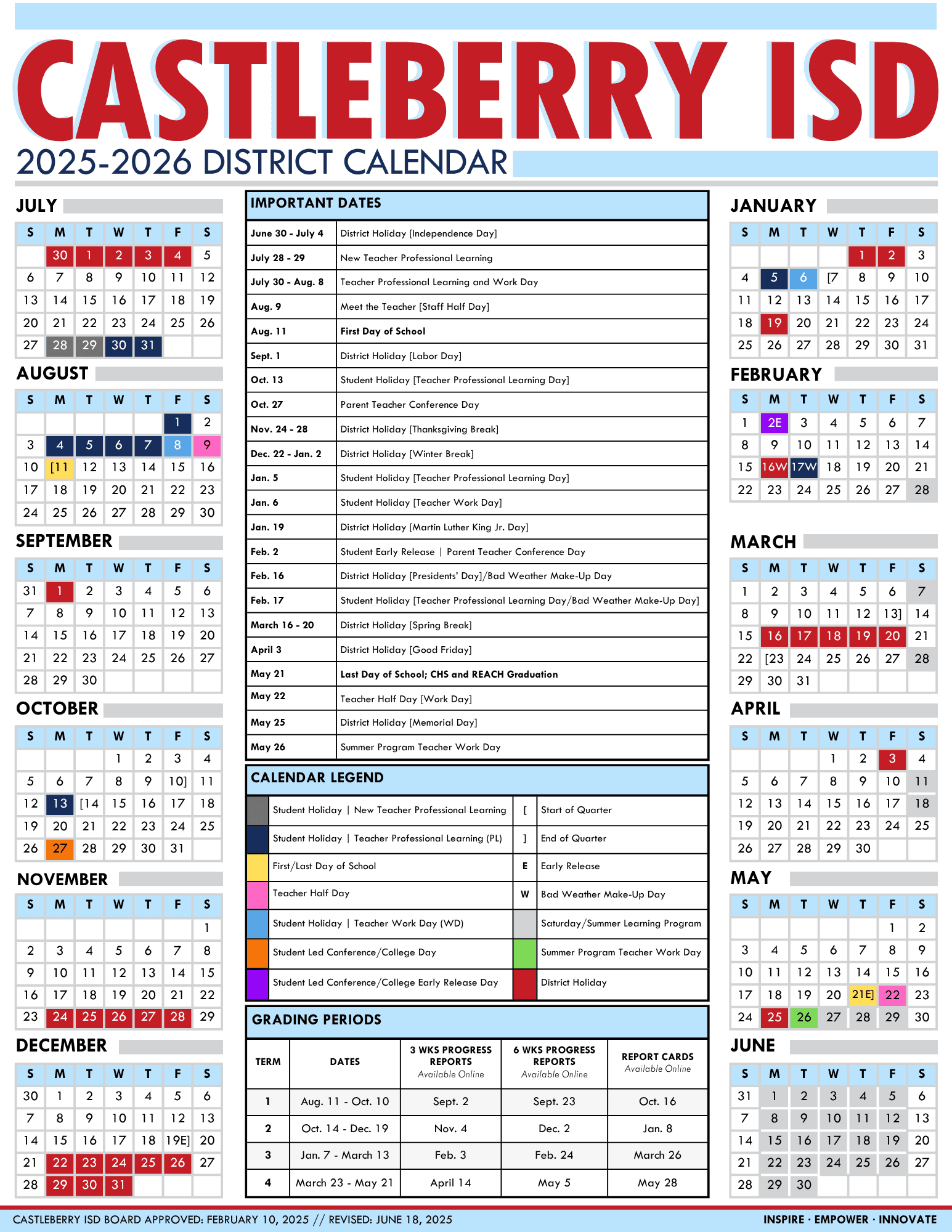
Impact
Elevated a high-visibility district publication into a cohesive brand asset
Improved readability and parent navigation
Established a repeatable layout system
Reinforced brand consistency across major publications
Brand in Action
To ensure adoption beyond digital and print materials, the identity system was extended into environmental and operational touchpoints.
Standardized ID badge system
Event and athletics signage
Fleet graphics and exterior branding
Apparel and merchandise alignment
ID Badge System Overhaul
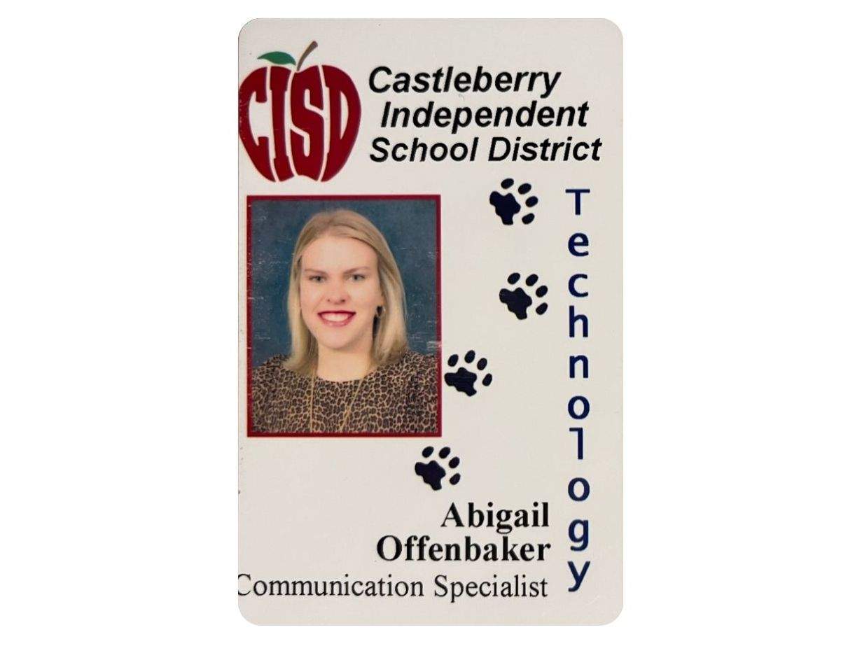
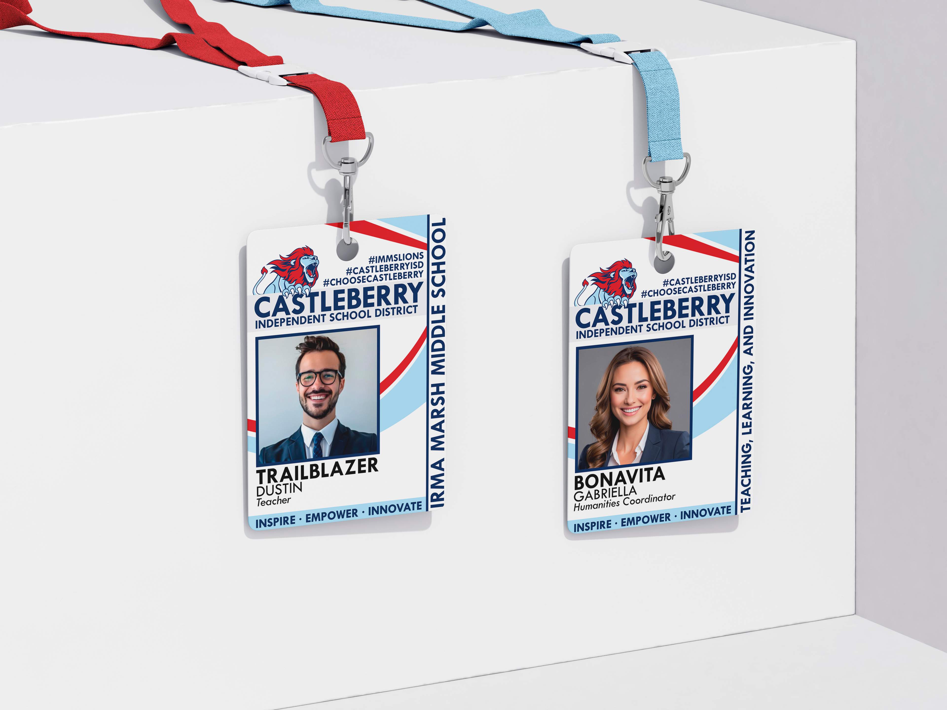
From inconsistent, outdated credentials to a unified, enterprise aligned badge system.
The previous badge design lacked hierarchy, visual consistency, and alignment with district branding. Logos, typography, and layout varied across campuses and roles.
The redesigned badge system introduced:
Clear visual hierarchy (name, role, campus)
Standardized logo placement and brand colors
Consistent layout adaptable by campus or department
Improved professionalism and readability
The result was a secure, scalable badge system aligned with the broader identity architecture.
Environmental Brand Applications
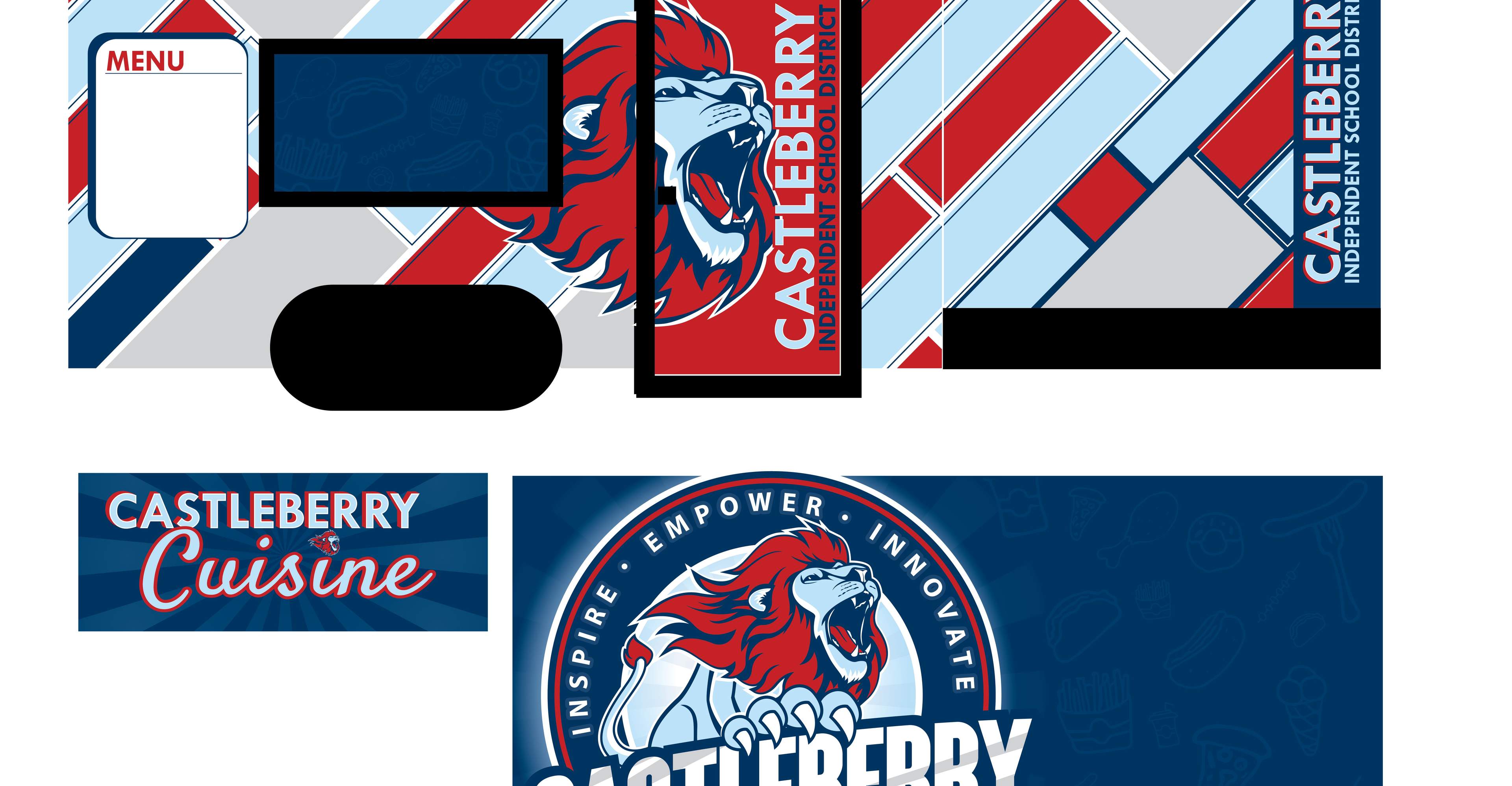
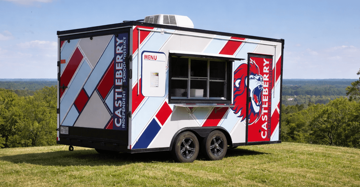

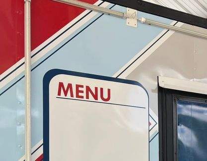
Mobile Food Trailer
Applied district identity system to large-scale environmental graphics
Ensured consistent logo hierarchy, color ratios, and messaging
Reinforced brand visibility at community events and outreach initiatives
+165%
Growth in Out-of-district YoY
35+
Branded ParentSquare templates created